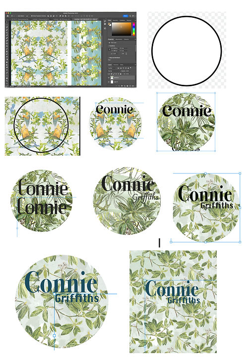
Logo Design
For the logo design for the front page and throughout the website. I wanted to use one of my repeat pattern designs. I chose a circle as i felt that it would enable to have a s small view of the pattern and a square or other rectangular may feel too harsh.I trailed many different repeat pattern structures with a range of different fonts overlayed with my name. I decided on a very dark green font as i wanted the name to contrast the backgrounds and be readable even if the logo was very small .I also experimented with cropping different sections of the repeat in to a pattern. For the final design i chose part of a digital collage made up of leaves illustration and paintings.I liked the sense of the large block painted shapes combined with the small branches which were above and below the text. I think that the simplicity of the leaves represents the type of work i create and the font is simple with the Griffiths in an more elaborate font at a slight angle which makes it feel traditional which i think links back to my own work as often explore historical locations.